
Blog Post Heading
Blog Post Content
By Christine Vogt
Senior Editor, MindEdge Learning
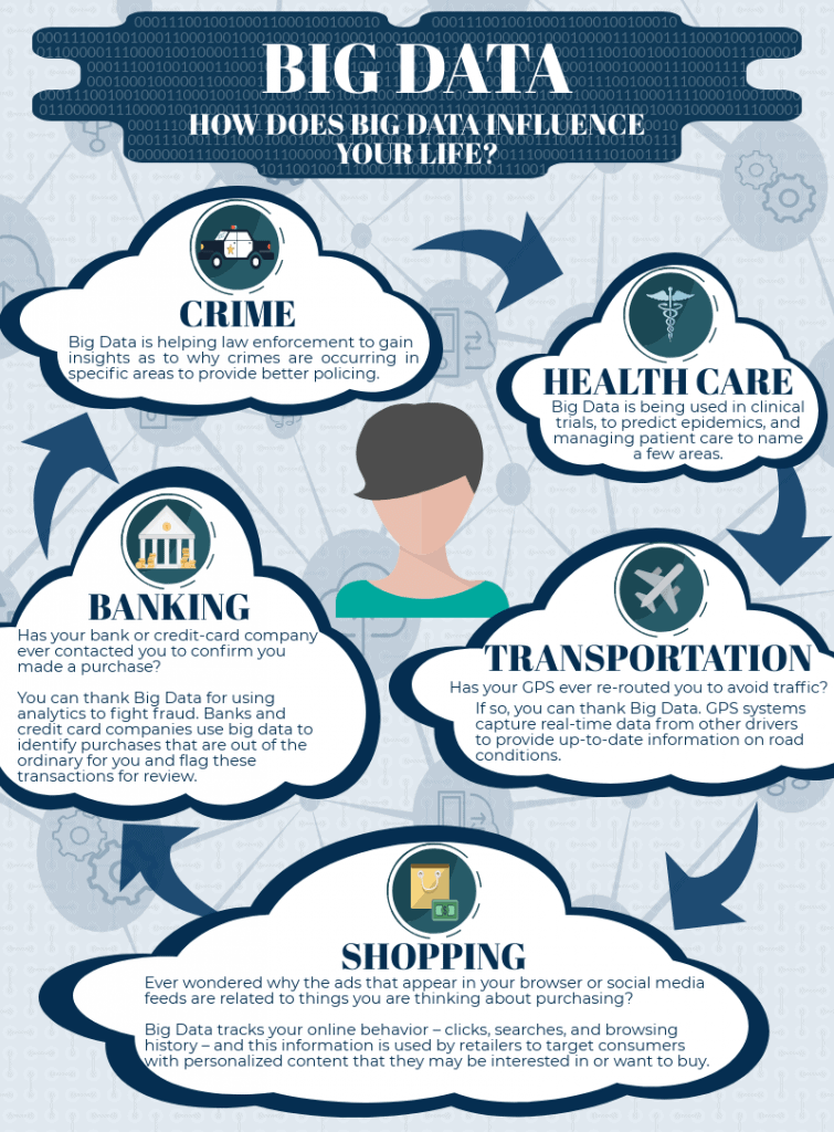
In today’s world, the influence of Big Data is everywhere. In fact, our current output of data is estimated to be 2.5 quintillion bytes every day.
Just how much data is that? Well, if a byte of data was the size of a penny, and those 2.5 quintillion bytes were laid out flat, they would cover the entire surface of the Earth—five times!
To some, the very term “Big Data” is mystifying, and maybe even downright scary. For others, Big Data is an extraneous concept to which they pay little attention. Regardless of where you fall on this spectrum, Big Data influences your everyday life—often in ways you might not even realize or imagine.
Just how does Big Data influence your life? Below are just a few of the many areas where Big Data makes a Big Difference:
It is not surprising the rise of Big Data has caused the world around us to become more and more quantified. For most of us, though, the most important point is not the volume of data that is generated on a daily basis—it’s how we interpret and make sense of the Big Data that surrounds us. In short, to put Big Data in the proper context, it is becoming increasingly important to understand the language of statistics. To help you learn the language, here are three statistical concepts that come in handy in everyday life.
Understanding that “correlation does not imply causation”
When two events occur together, a common assumption is that there is a cause-and-effect relationship between the two. Statistics teaches us that this is a common misconception: just because there is a correlation, or a relationship, between two events does not imply that one has caused the other. More often where there is an association, causation does not exist. For example, there is a proven association between ice cream sales and crime rates. The more ice cream that is sold, the higher the crime rate. However, there is no causation between these two variables. Increasing ice cream sales do not cause crime rates to increase, and increasing crime rates do not cause ice cream sales to increase. In this instance, there is another variable influencing both: higher temperatures. Summer, when temperatures are generally at their warmest, is often when crime rates and ice cream sales are at their highest. However, does this mean that higher temperatures lead to a higher crime rate? Only a well-designed statistical experiment would be able to determine if this is a causal relationship.
Recognizing when data is being manipulated
Statistics provides us with a foundation of knowledge that helps us recognize when data is being misrepresented or distorted to support a particular point of view. Specifically, it is crucial to be aware that there are many ways that graphical displays can be manipulated and edited to misrepresent data. Changing the scales of axis labels is just one of the many ways in which data can be distorted:
Consider the following two graphs that both illustrate the same data for the number of admissions per year at three different universities. What do you notice?
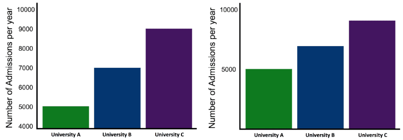
In the first graph (Graph A), the differences among the universities’ admissions appear to be greater than they do in the second graph (Graph B). The reason: Graph A’s vertical scale does not start at zero. This technique, known as truncating, exaggerates the differences among the three universities.
Interpreting data to become better consumers of information
Statistics is nothing more than the language of data, and understanding statistics provides you with the tools to become a better consumer of information. It lets you make your own assessment of data that is being presented to you, rather than relying on someone else’s interpretation. Statistical literacy also provides you with the basis to think critically about the statistical evidence that we encounter in everyday life. For example, election results often include a reference to something called a “confidence interval.” Let’s say you hear the results of an exit poll, which shows that—based on a confidence interval of 98 percent, with a margin of error of plus or minus four points—51 percent of voters voted for Candidate A. What does this mean? Should you skip going to the polls to vote? After all, you were planning to vote for Candidate B, but it looks like Candidate A has already won the election. So, should you stay home? Of course not! Understanding the language of statistics helps you see that, while the race is tight, it may be far from over. Specifically, the report is 98 percent sure that Candidate A’s share of the vote may be as low as 47 percent (51 minus 4) and as high as 55 percent (51 plus 4). These results tell very different stories about the election—and either one should tell you to get out and vote!
For a complete listing of MindEdge’s course offerings on data analytics, click here.
[An earlier version of this article ran in the MindEdge Learning Workshop Blog on August 24, 2018.]
Copyright © 2020 MindEdge, Inc.